Role
Product Designer
Responsibilities
User Research, Interaction, Visual design, Prototyping & testing.
Tools
Figma, Procreate, Zoom, Maze
Overview
The Project
The inspiration behind Mobo stems from the real-life experiences of a friend living in Gabon, where paper prescriptions remain prevalent. Recognizing the challenges faced by individuals in managing their prescriptions, particularly in regions with limited access to digital healthcare solutions, the idea for Mobo was born.
Through research, analysis, ideation, and implementation, I designed the MVP (minimum viable product) with maximum functionality and accessibility.
The Problem
The process of visiting a pharmacy in person to drop off or pick up paper prescriptions can be burdensome for many individuals, especially those with busy schedules, mobility limitations, or difficulties accessing healthcare services. Also, paper prescriptions can be lost or damaged, causing problems with taking medication as prescribed.
The Solution
Mobo aims to streamline the process of sending prescriptions from users to their preferred pharmacy. The app allows users to capture an image of their paper prescription using their smartphone and securely transmit it to the pharmacy for fulfillment. This digital approach will simplify the need for physical visits to the pharmacy and reduces the likelihood of prescription-related issues, such as miscommunication or delays.
Research
Competitive Analysis
Mobo is a prescription app that fills a need in the market. Other prescription apps mostly focus on medication reminders, dosage tracking, or drug information. While these features don’t align with our product’s purpose, we think a prescription refill or renewal feature would be a good addition.
User Interviews & Surveys
The research focused on the struggles that users faced from the moment they received their paper prescriptions until they left the pharmacy. I collected feedback from 15 people through surveys and interviews and gained several key insights and takeaways from the feedback. Some solution ideas were strongly supported by the feedback, while others highlighted the need for additional options to better address users’ needs.
Which features would you find most valuable in a prescription management application?
- Integration with health insurance.
- Notification for refill.
- Medication history.
- Home delivery.
Have you ever faced challenges when managing or sending prescriptions to a pharmacy?
- Medecine not available at the pharmacy.
- Long wait time to have prescription filled.
- Prescription hard to read or missing signature.
- Not having enough money at checkout.
Ideate
Our users
I analyzed my survey data and noticed four different types of users I might get for this app:
- Adults, often with demanding schedules.
- Older adults, sometimes with mobility limitations
- Caregivers for kids and/or older parents.
- Healthcare providers/pharmacies.
Defining the MVP
Based on the available data and considering multiple constraints, the MVP of Mobo is designed to provide a starting product that addresses key user needs. Mobo is a comprehensive app that consists of two sides: the client side for users and the business side for pharmacies and healthcare providers. However, for this specific case study, the focus will be on developing the client side of the app.
The MVP of Mobo includes the following features:
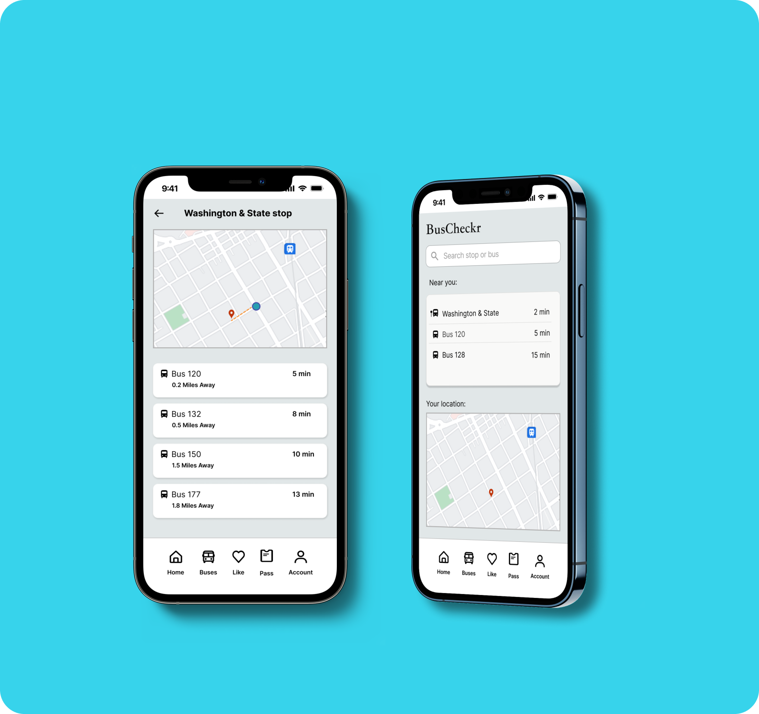
- Scan prescription: Users can scan a picture of their paper prescription to upload it to the app.
- Select pharmacy: Users can select the pharmacy where they want their prescription filled.
- Track status: Users can track the status of their prescription, from upload to fulfillment.
- Receive notifications: Users can receive notifications about their prescription, such as when it has been filled or when it is ready for pickup.
Refill option and delivery: These are options that will be added later. Note that, considering the location of use of the product, the home delivery may be added because there is actually no service provider offering this option in this country.
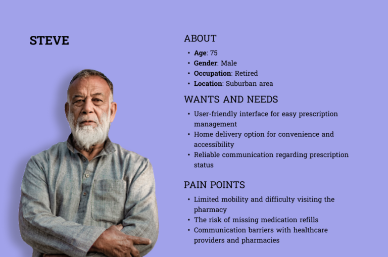
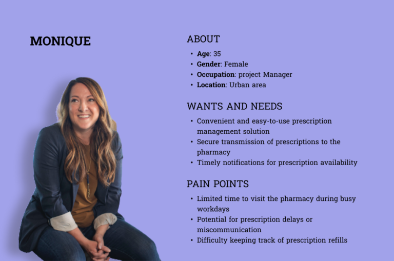
Personas
"As a retiree with mobility challenges, I want to manage my prescriptions through Mobo and have them delivered to my doorstep, so I can conveniently access my medications without the need for physical travel or assistance."
"As a busy professional, I want to send my prescriptions to the pharmacy so I can save time by avoiding waiting while my prescription is being filled and focus on my work responsibilities."
"As a caregiver for my elderly parents, I want to use Mobo to easily upload and manage their prescriptions, so I can ensure they receive their medications on time and avoid any confusion or missed refills.."
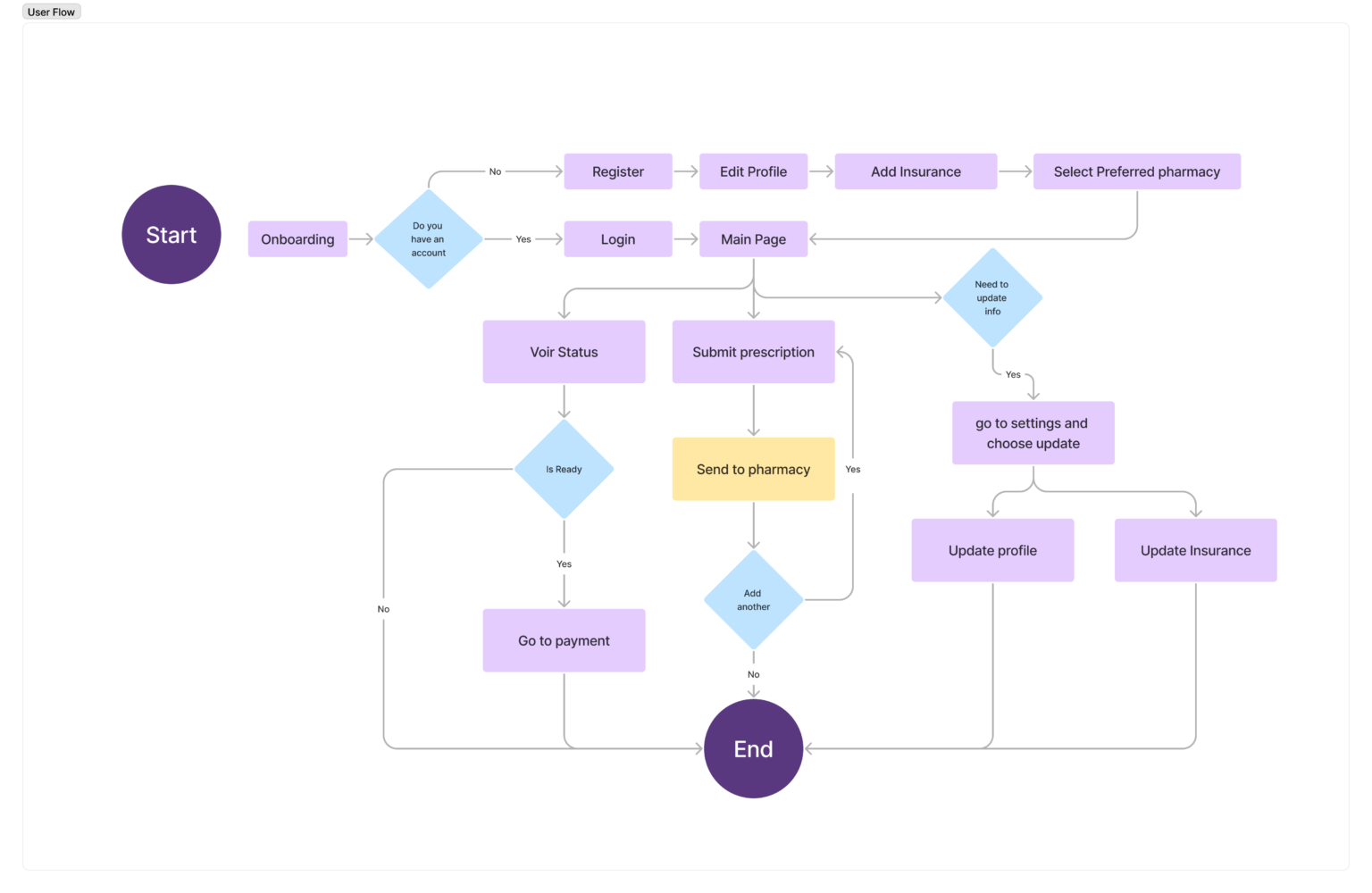
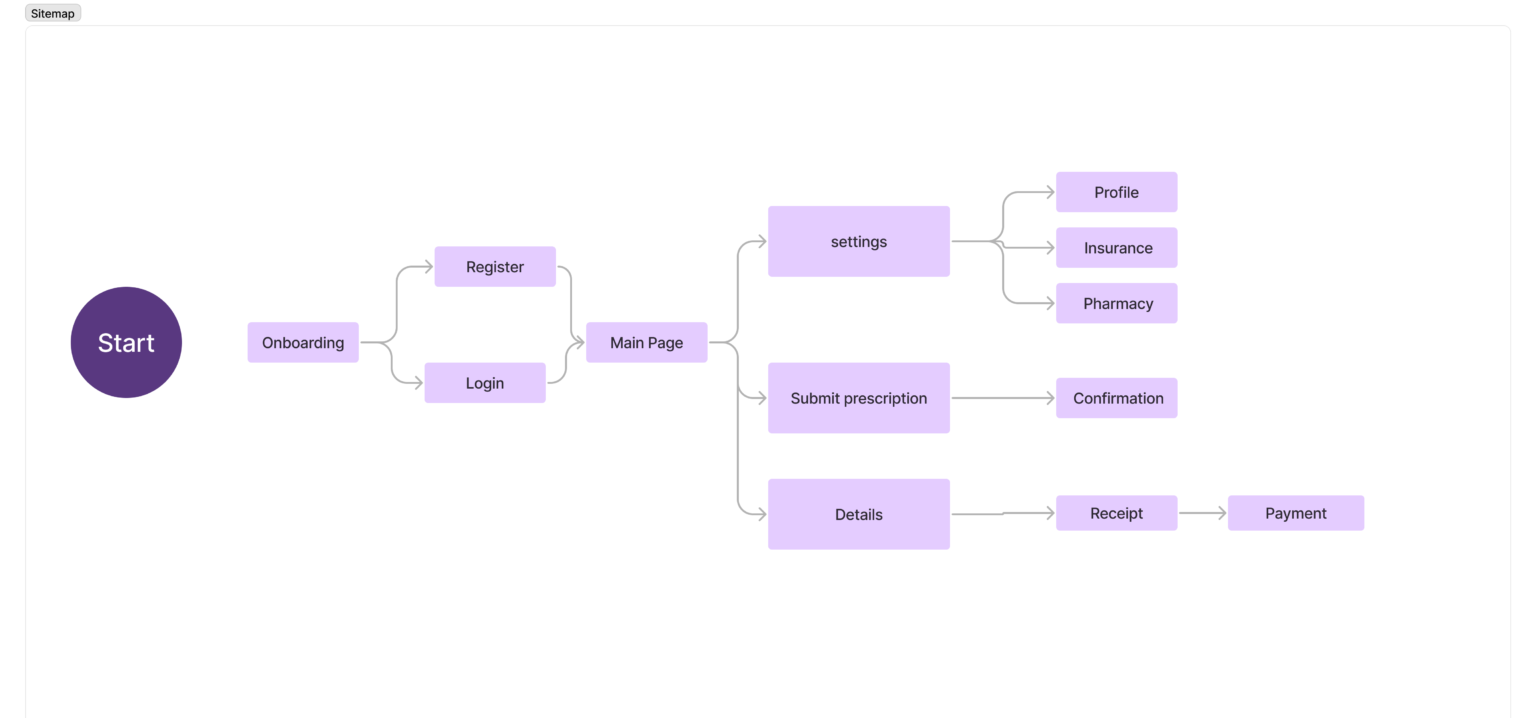
Information Architecture
After establishing the users’ wants and needs, I needed to organize the structure of the application. To do this, I identified all the destinations in the user flows and structured them into a logical framework. I began by making user flows to visualize how users would interact with the product to achieve their goals. Then once I had a good understanding of how users would use the application, I could start to organize the content and features into a logical structure. This ensured that users would be able to find what they were looking for quickly and easily.
Design
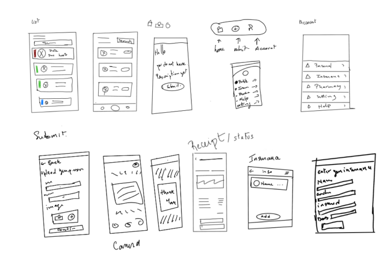
Sketches and Low-Fidelity Wireframes
To start the design step, I made quick sketches of some of the main screens with all the information I wanted for each of them. This gave me the first idea of the layout that I wanted. Once I had a few sketches that I liked, I created low-fidelity wireframes. These wireframes were more detailed than the sketches, but they were still not perfect. I then created a prototype to gather feedback from users.
Early Feedback
I conducted four usability tests to collect early feedback of the low-fidelity prototype.
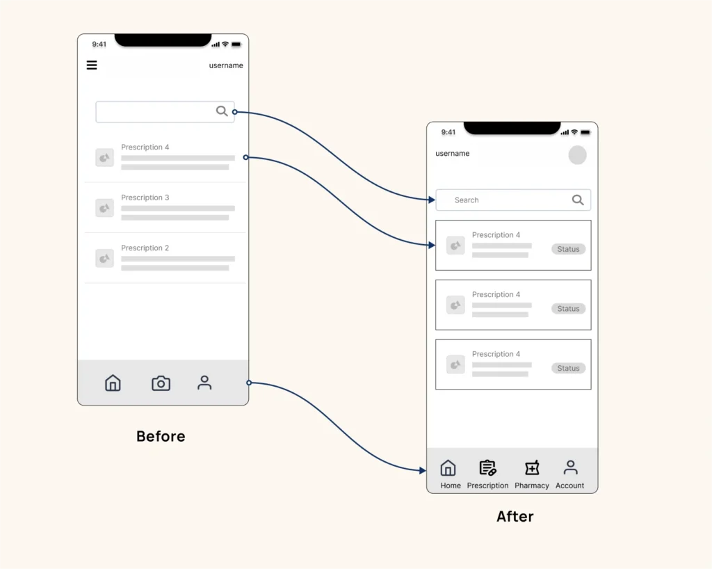
Based on the user feedback, I made the following changes:
- Adding pharmacies to the navigation bar
- Refining language
- Updated the payment flow
- Adding more visual feedback and descriptors
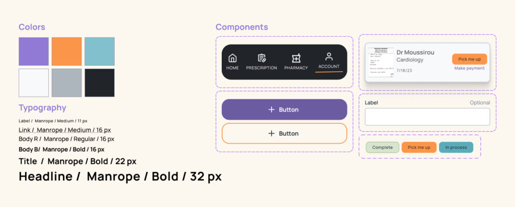
Style Sheet
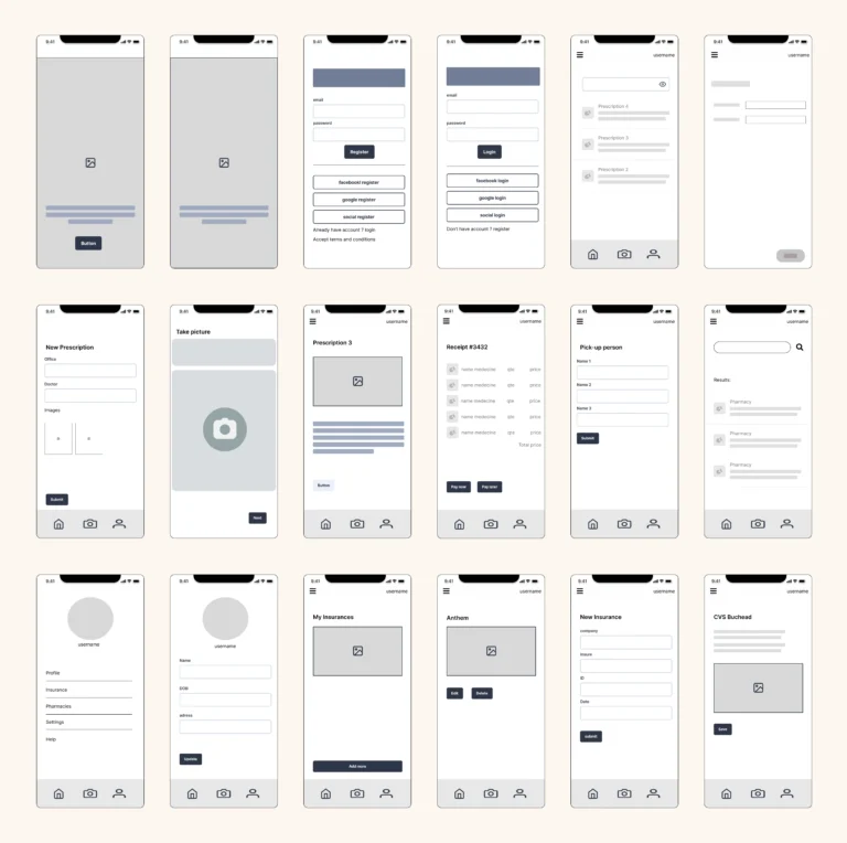
High-Fidelity Prototype
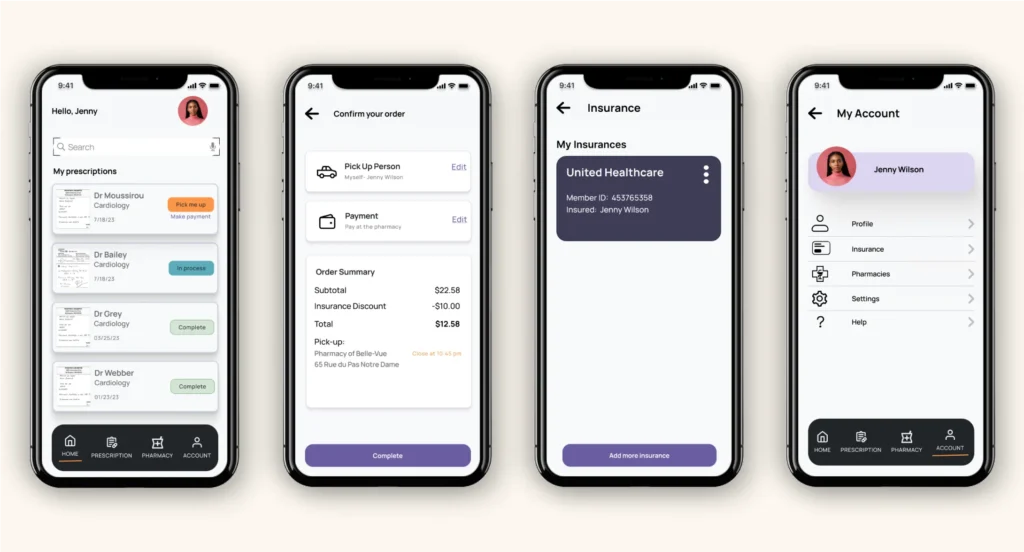
Once I had gathered all the necessary elements, I proceeded to transform the wireframes into comprehensive mockups. This involved applying my chosen styles and design elements to create a high-fidelity prototype. As I continued working on the project, I encountered various questions and challenges that prompted me to reassess and enhance certain screens.
Testing
Usability Testing
Using my high fidelity prototype, I conducted six usability tests to assess how users handled crucial user flows and how they responded to visual elements.
Tasks tested:
- Signing up for a new account
- Sending a prescription to the pharmacy
- Pay for the prescription
- Add insurance information
All users were able to complete these tasks quickly and with ease successfully without intervention. Most feedback was positive, but there were also some suggestions for adjustments that could make the application better.
Takeaways
Next Steps for Mobo
Add features: During user research, we found that users wanted a refill and reminder feature. We believe that these features would be a valuable addition to the app and would improve the user experience.
- Refill feature: This feature would allow users to request a refill of their prescription without having to go to the doctor or pharmacy. This would be especially helpful for users who are taking long-term medications.
- Reminder feature: This feature would send users a notification when their prescription is due to be refilled. This would help users to avoid running out of medication.
Expanding to the business side of the app: Currently, we are focused on the user side of the app. However, there is a need for a business side of the app. Which would allow pharmacies to manage the reception of prescriptions from users. This would include features such as accepting prescriptions, verifying insurance, and filling prescriptions. In order to develop a business-facing version of the app, we would need to redo the whole process. This includes doing research, creating new wireframes, prototypes, and testing the app with users.
What I learned
Some key takeaways from this project are:
- Focus on building an MVP. Focus on building an MVP: Building an MVP was a key lesson I learned during this project. Initially, I had ambitious plans for incorporating numerous features and functionalities into the app. However, I soon realized that trying to develop a full-featured product from the start could be overwhelming and time-consuming. By embracing the concept of an MVP, I learned to identify and prioritize the essential features that addressed the core problem and provided value to users.
- Focus on information architecture: Information architecture plays a crucial role in ensuring that the app is organized and structured in a user-friendly manner. During the project, I realized that overlooking the information architecture could result in a confusing and disjointed user experience. By taking a step back and reassessing the app’s structure, I learned to create a logical and intuitive flow that guided users seamlessly through each step of the prescription management process. Paying attention to information architecture helped me optimize the app’s usability, enabling users to navigate effortlessly and accomplish their tasks with ease.