Role
UX Research & Design
Responsibilities
User Research, Interaction, Visual design, Prototyping & testing.
Tools
Figma, Procreate, Miro
Overview
The Project
The AGA Website project is an initiative aimed at connecting and empowering the Gabonese community in Atlanta. Recognizing the need for a centralized platform that fosters community engagement, celebrates culture, and provides valuable resources, the project aims to address the challenges faced by Gabonese individuals in Atlanta in terms of networking, cultural preservation, and accessing relevant information.
The Problem
The Gabonese community in Atlanta has lacked a dedicated platform to connect and engage its members effectively. Limited opportunities for networking, cultural exchange, and access to relevant resources have created challenges for Gabonese individuals in Atlanta. The absence of a unified online presence has hindered their ability to strengthen community bonds, preserve cultural heritage, and address common concerns.
The Solution
The AGA Website project presents a comprehensive solution to the aforementioned challenges. By creating a vibrant online platform, the project aims to provide Gabonese individuals in Atlanta with a dedicated space to connect, engage, and thrive. The website will serve as a hub for community news, events, resources, and networking opportunities. It will facilitate communication and collaboration among members, while also promoting Gabonese culture through the sharing of traditions, stories, and experiences.
With user-friendly features, an intuitive interface, and a range of interactive functionalities, the AGA Website will empower community members to actively participate, contribute, and benefit from the platform. The website’s design and content will reflect the rich cultural heritage of Gabon while embracing modern technology to ensure accessibility and inclusivity for all users. By fostering a sense of belonging, providing valuable resources, and encouraging community involvement, the AGA Website project aims to strengthen the Gabonese community in Atlanta and promote a vibrant and thriving cultural identity.
Research
User Interviews & Surveys
To really understand what was needed for the website, in addition to what the President of the association asked me, I was able to interview 7 people from the three different categories of audience I am trying to reach.
100%
33%
67%
“I want to be able to get important news”
“I want to contribute and pay my membership”
“I want to be able to find resources and events”
Competitive Analysis
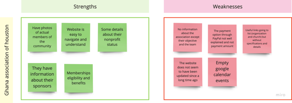
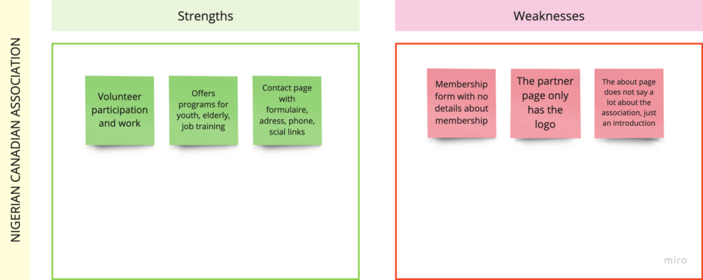
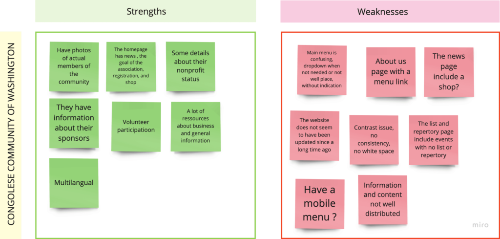
I went and looked into other associations, saw what their websites looked like, what they offered, and got an overview of their strengths and weaknesses. I wanted to understand what was working well for other associations and what could be improved. I also wanted to get a sense of the different ways that associations were communicating with their members and the public.
Ideate
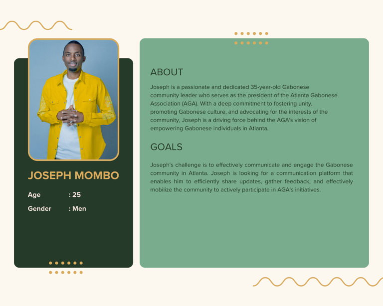
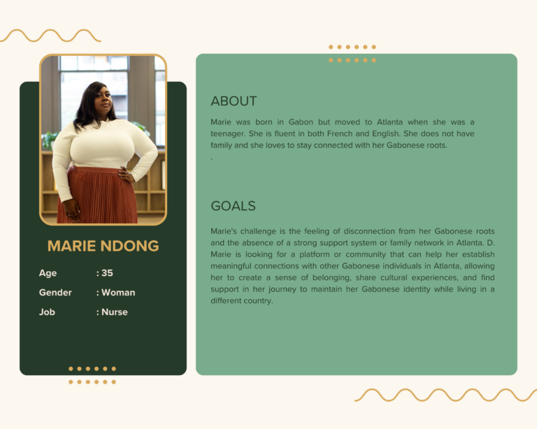
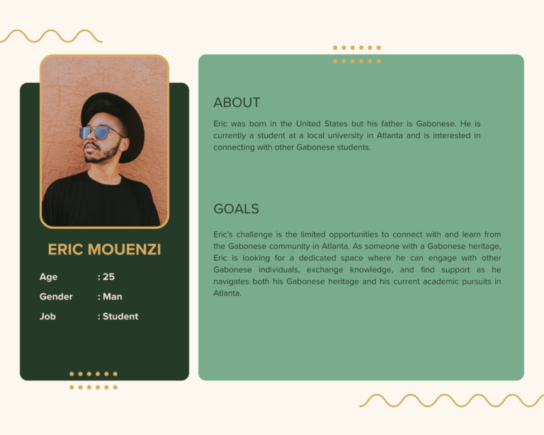
Personas
Information Architecture
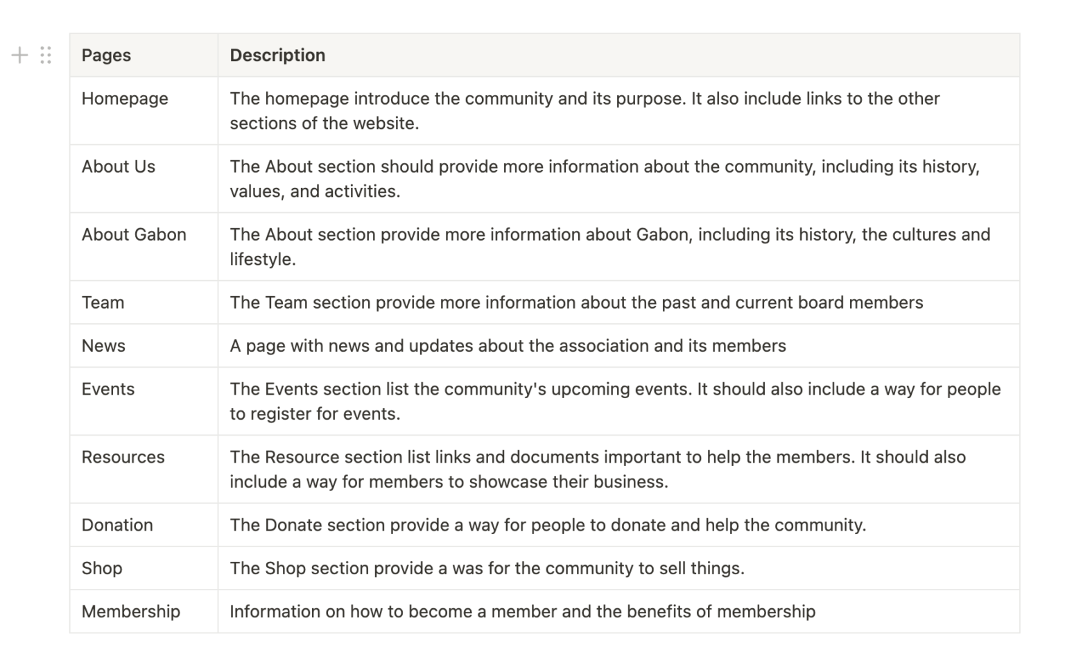
After establishing the users’ wants and needs, I needed to organize the structure of the application. To do this, I identified all the destinations in the user flows and structured them into a logical framework. I began by making user flows to visualize how users would interact with the product to achieve their goals. Then once I had a good understanding of how users would use the application, I could start to organize the content and features into a logical structure. This ensured that users would be able to find what they were looking for quickly and easily.
Design
Low-Fidelity Wireframes
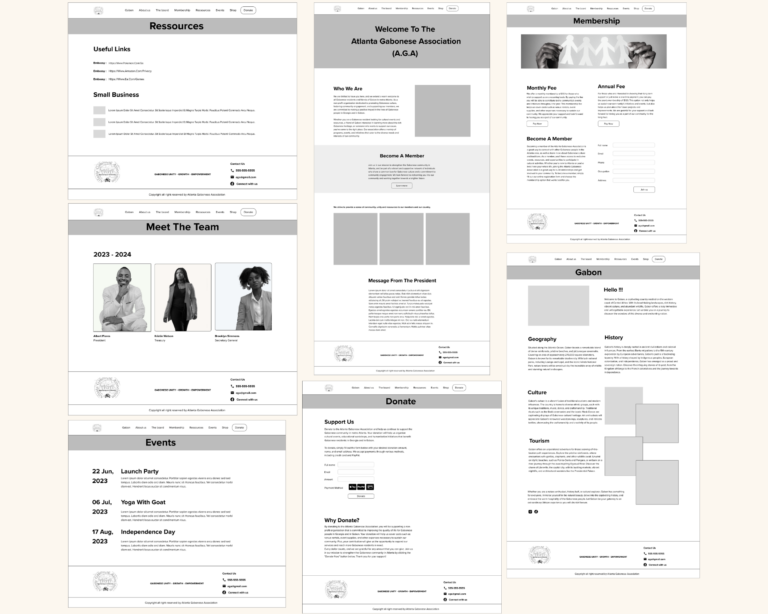
I created wireframes from all the screens that highlighted that we wanted to build out for the final prototype.
Feedback
I presented the wireframe to the current team members, seeking their valuable feedback to ensure that the layout and navigation resonated with the business expectations and needs. They all approved the wireframe, signifying its successful alignment with the envisioned goals. However, the team did request a few enhancements, including the addition of a news section to keep the community updated and a thorough review of the main navigation to ensure an intuitive and seamless user experience.
Style Sheet
High-Fidelity Prototype
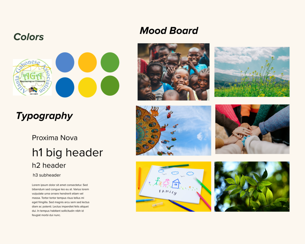
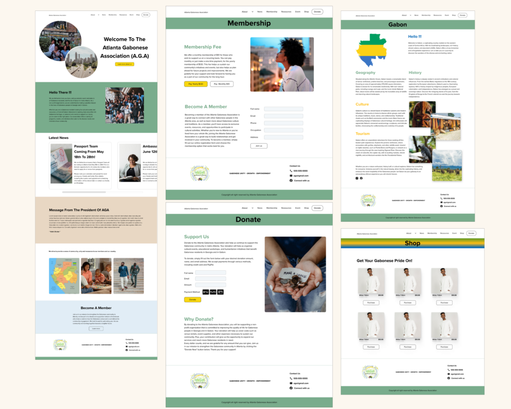
Once I had gathered all the necessary elements, I proceeded to apply my chosen styles and design elements to create a high-fidelity prototype.
Testing
Usability Testing
With my high-fidelity prototype in hand, I embarked on a comprehensive usability testing journey with the AGA team and four other people (two members and two non-members). The objective was clear – to assess the prototype’s effectiveness in achieving its purpose and objectives while evaluating the website’s navigation and information architecture. I sought direct feedback from users, uncovering their impressions, preferences, and valuable suggestions for improvement.
The feedback received from the usability tests was overwhelmingly positive, validating the hard work put into the prototype’s development. The most common suggestion was to improve the navigation. After multiple iterations and testing, I was able to determine which was the best navigation for the users.
Takeaways
Next Steps for the AGA's website
After the high-fidelity prototype has been finalized and approved, the next step in the development phase of the website involves choosing the development platform. In this case, considering WordPress or Google Sites, the development team will select the preferred platform based on the project requirements, client preferences, and development expertise. If WordPress is chosen, developers will begin building the website using WordPress as the content management system, customizing themes, creating custom templates, and integrating necessary plugins for enhanced functionality. If Google Sites is chosen, developers will utilize the platform’s built-in features and customization options to create and design the website. Throughout the development process, the team will focus on translating the design into a fully functional website, ensuring responsiveness, optimizing performance, and implementing necessary features and functionalities to deliver a seamless user experience.
What I learned
- Communication: By maintaining open and frequent communication with the client, I ensured a clear understanding of their goals, expectations, and requirements for the website. This allowed me to translate their vision into a user-centered design that addressed the specific needs of the target audience.
- Accessibility Considerations: Considering guidelines such as WCAG to ensure an inclusive experience for all users.This led to the implementation of accessibility best practices, such as proper use of headings, alternative text for images, keyboard navigation support, and color contrast considerations, ensuring an inclusive experience for all users.
By prioritizing both client satisfaction and user accessibility, I learned the importance of balancing client objectives with user-centric design principles, resulting in a successful project that met the needs of both parties
