Role
Product Designer
Responsibilities
User Research, Interaction, Visual design, Prototyping & testing
Tools
Figma, FigJam, Google Forms, Procreate
Overview
The project
I was tasked with designing an app that provides clear access to transit information. This includes arrival times, stop & route information, and estimated walking time to stops. Through research, analysis, ideation, and implementation, I designed the MVP (minimum viable product) with maximum functionality and accessibility.
Users and the Audience
The target audience for the app was bus riders in the city, including both regular commuters and occasional riders. The app was designed to be accessible to a wide range of users, including those with limited technological proficiency.
The Problem
Following the recent expansion of the city’s public bus system, numerous bus routes have been added. This has caused confusion among riders as many of these routes stop at the same bus stops. Moreover, despite the updated tracker feature, the city is unsure of how to effectively share real-time bus arrival information with riders.
The Solution
BusCheckr is a streamlined bus app that informs the riders about which bus will arrive at each stop and when. It also tells them how long they have to get to the bus stop. Additionally, the app provides them with the full bus schedule and a way to pay for the bus pass.
Research
Competitive Analysis
Using the SWOT method, I analyzed the strengths, weaknesses, opportunities, and threats of three apps; Marta, Citymapper & Moovit. The purpose of this was to learn from others’ mistakes and discover what features users find most helpful.

Marta
Strengths:
- See the schedule of buses with the expected times at each stop and map.
- Provides real-time information on buses and trains in the Atlanta area (alert any issue).
- The app offers real-time arrival information, route maps, and trip planning features.
- User-friendly interface that is easy to use and navigate.
Weaknesses
- There is no search option for buses and stops.
- Interface contrast issue.
- Some users have reported that real-time arrival information is not always accurate.
Moovit
Strengths:
- Location to nearest stop and bus line with estimated walking time with photo of stops.
- Route preference – trip history
- User-friendly interface (dark mode) that is easy to use and navigate.
- The app provides real-time information on buses, trains, and other forms of public transportation.
- The app allows users to set up real-time alerts for arrival times and service changes.
Weaknesses
- Relies on user-generated content to update real-time information, which may not always be accurate.
- The app can be a bit overwhelming to use, as it offers so much information.
- Some users have reported that the app occasionally crashes or freezes.

Citymapper
Strengths:
- Lyft / Uber option after hours
- Show the trip and estimated time
- Offer accessibility in setting
- Calendar, set places.
Weaknesses
- Learning curve.
- Some users have reported that the app occasionally crashes or freezes.
Overall, all three apps have their strengths and weaknesses, and the best app for you will depend on your location and specific needs. The key takeaways from my competitive analysis were that the following features are valuable…
- Provide real-time information on public transportation.
- Maps with details.
- Easy to use and navigate.
User Interviews & Surveys
After collecting feedback from 22 bus riders through surveys and post-interviews, I gained several key insights and takeaways. While some solution ideas were strongly confirmed, the feedback also highlighted the need for another option to better address users’ needs. They wished for a better way to pay for the bus fare. So we added it.

Ideate
Personas
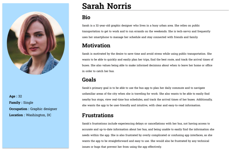
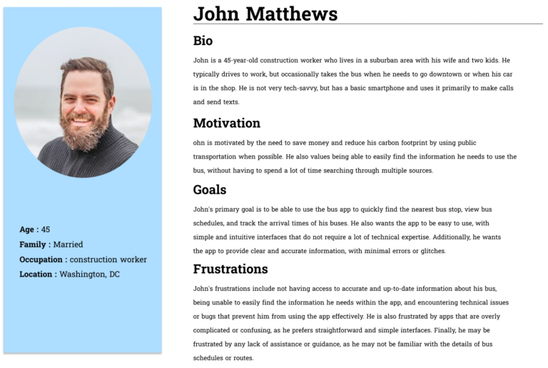
Through a combination of quantitative and qualitative data collected from interviews and surveys, I developed two user personas – Sarah and John – to better understand and empathize with the needs and goals of my main users.
User Stories and Flows
With a solid understanding of user wants and needs, I created 4 user stories to reference throughout the rest of the process.
- As a bus rider, I want to know when my bus is arriving at the Washington & State bus stop, so I can calculate how much time I have to reach the bus stop.
- As a bus rider, I want to know the next bus arriving at the Washington & State bus stop, so that I don’t rush to the bus stop if it is not my bus.
- As a bus rider, I want the ability to view future arrival times for any of the seven bus lines (serving Washington & State), so that I know when my bus arrives.
- As a bus rider, I want the ability to recharge my bus pass, so that I don’t worry about having exact change to pay for the bus.
I created 1 user flow that covered each of the 4 user stories.

Design
Sketches
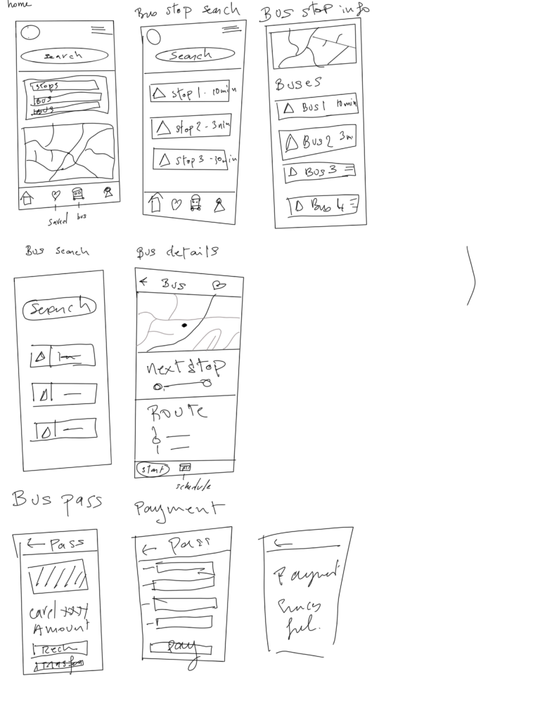
For the design process, I started out by making sketches of all the screens with all the information I wanted for each of them. It was imperative for me to build out the blueprint to better visualize the page layout. Then I built the low-fidelity wireframes.
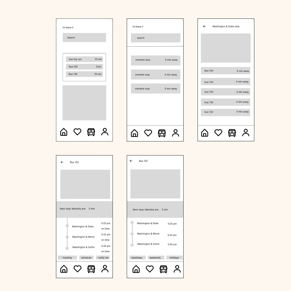
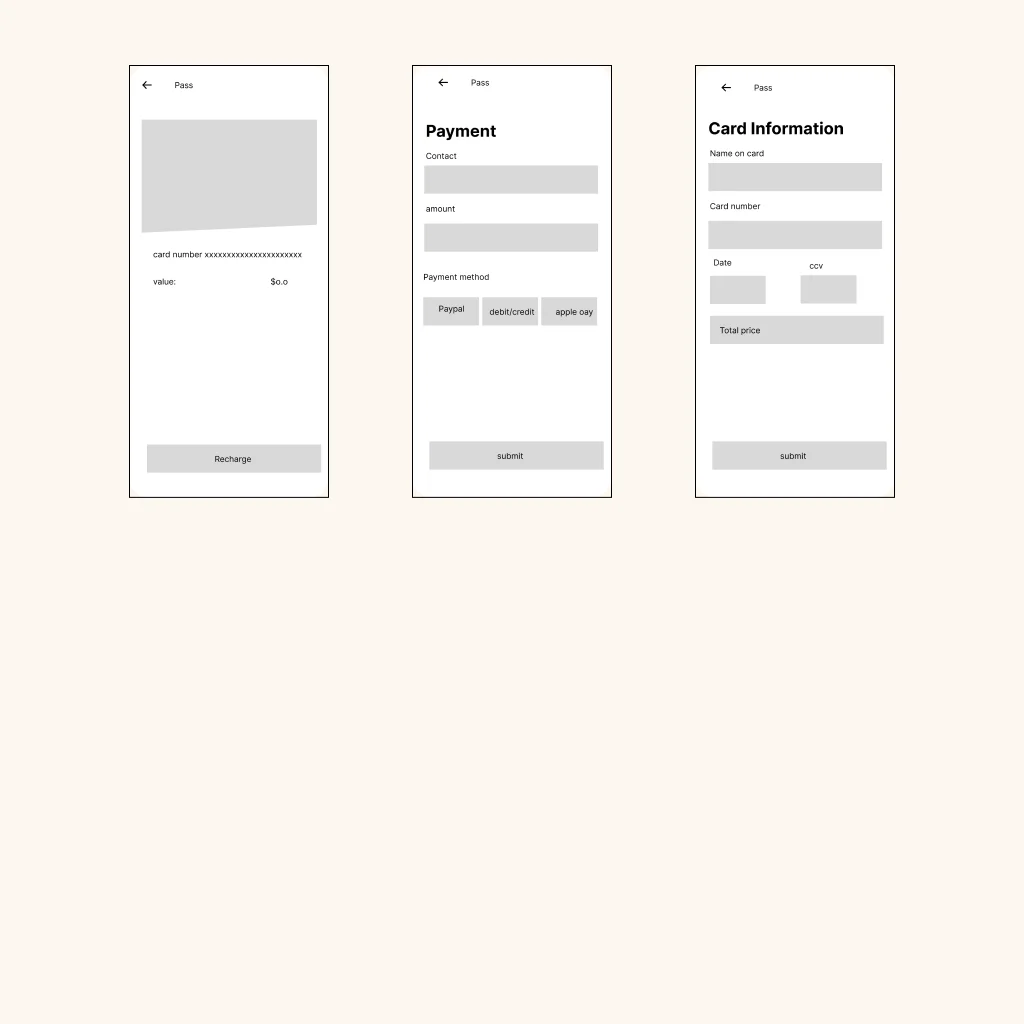
Low-Fidelity Wireframes
I kept the low-fidelity screens pretty basic and simple as most competitors’ website layout was also simple and straight to the point.
Branding

High-Fidelity Prototype
The high

Testing
Once I completed designing the high-fidelity screens and building its prototype, I conducted the usability test. With the feedback I received from the usability test, I made my final iterations.
Usability Testing
I conducted usability tests with 5 individuals via Zoom and in person. This was an valuable part of my process.
The testing objectives include:
Test the overall ease of app navigation
Test if the design is consistent throughout the site
Test if users can locate the bus stop and bus arrival successfully
Test if users can locate the bus schedule and view live tracking successfully
Test if users can buy a bus pass successfully
Observe any difficulties or pain points
Overall findings: 3 of the testers had no issue navigating and understanding what was happening, and 2 of the testers took a few minutes to see around, but in the end, they all said it was very easy to use.
In most cases, the concern was mainly about the application missing colors and being flat, which I noticed myself as well.
All users completed tasks successfully without intervention. Most feedback was positive, but there were also some suggestions for adjustments that could make the website better.
Takeways
What I learned
Throughout the UX process, I gained invaluable insights. Previously, my research approach was focused solely on client needs. However, I discovered that user research is crucial and should be at the core of any project, as users are at the heart of it.
I also learned the importance of feedback. Feedback helped me see what was right in front of me and allowed me to see beyond my own perspective. This allowed me to identify areas for improvement in the project design. Design is a continual learning process that requires iteration and testing. It may never feel truly finished, but this constant evolution makes it exciting.
